The key J

If you wish something new in Smart Keyboard, here is the place to ask!
Post Reply
LuwNL
Posts: 4
Joined: Thu Oct 28, 2010 6:38 pm
Phone: HTC Legend 2.1

The key J

Post by LuwNL »

Dear Cyril,

Thanks for the effort u put in this keyboard... got the pro version.
Couldn't find an e-mail adress to mail this tiny comment tho the Key " J " on my keyboard looks like it's 1 or 2 px to far to the left, it only happens in Capital.

Could be just my Keyboard (running on an HTC Legend), i tried to fix it myself but can't find any letters in the folder, if i can fix it lemme know how.

Sorry being such a b*tch tho it just looks kinda odd :roll:, maybe a tiny hit to the right in the next release.


Thanks for the keyboard... works waybetter then the regular HTC Legend one.

Yours,

Luw
zen
Posts: 50
Joined: Mon Sep 20, 2010 2:36 am

Re: The key J

Post by zen »

Happy to see I'm not the only one who's (silently) fretting over this. Actually, there are more letters that are off-center. ;) Just to name a few: Y, U, M, W, Q, I, O. There are even more in lowercase. :P In fact, there are only four letters that are perfectly centered: A, H, S, Z. :)

I believe there's no elegant way to fix this. Either SKpro uses a different typeface, or let Cyril manually realign the letter positions; which is not really ideal.

If you'd care for an explanation why they're not centered, I can offer you some. :D It has to do with two reasons. First, the default typeface used on Android is Droid Sans, and although that typeface contains its own kerning hints information, Android doesn't use it. Instead, Android applies its own kerning with help from a system library called FreeType. For normal text, it works fine most of the times. Unfortunately, when the letters (glyphs to be exact) stand alone, like on SKpro, they're still kerned, hence making them off-center. The second reason is that for font-smoothing, Android doesn't use sub-pixel, to maintain optimal graphics performance. It uses grayscale. So glyph outlines just fall on the nearest pixel possible, making them look even more off-center.

Personally, I think Droid Sans is a beautiful typeface. 
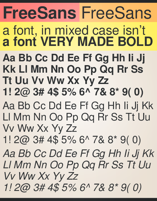
http://www.ascenderfonts.com/font/droid ... fonts.aspx It's just not meant for keyboard interface. A better choice would be FreeSans, with its extensive Unicode support and friendlier kerning. Image
User avatar
cyril
Developer
Posts: 2079
Joined: Tue Feb 02, 2010 4:02 pm
Phone: Nexus One 2.3
Location: Nice, France

Re: The key J

Post by cyril »

OK ok, I guess it just raises the priority of extra font support ;)
Cyril
LuwNL
Posts: 4
Joined: Thu Oct 28, 2010 6:38 pm
Phone: HTC Legend 2.1

Re: The key J

Post by LuwNL »

Thanks for the feedback Zen, and thanks for giving it priority Cyril.

Never knew it had to do anything with kernel of the font (i just thought Cyril mannually placed the font on the correct key), the "free" in FreeSans means it's free? ifso can Cyril make an option to select wich font u would like to use on SKP, so a list of fonts wich will be available to choose, including FreeSans, and a whole lot more of free fonts wich can be downloaded from the market / web.

Ready to help, ready to test.

Yours,

Luw
Legend owner
Post Reply